My Dashboard
My Dashboard is a visual summary of your activity results. It shows charts for up to four of your completed activities side by side, so you can review results across topics without opening individual reports. You can reorder the charts, switch chart types, swap in different topics, and save your preferred layout.
Accessing My Dashboard
- In the left navigation menu, select My Results.
- The My Dashboard tab opens by default. (You can also select My Dashboard directly from the My Results submenu.)
You can also get there from the home dashboard: select the chart icon in the header of the Review My Activities widget.

Understanding the dashboard
- The dashboard shows up to 4 charts, one per topic. If you see fewer, you haven't completed activities in that many topics yet.
- Each chart is labeled with its topic and activity name, with the topic's color band at the top.
- Each chart loads your most recent completion of that activity by default.
- If you haven't completed any activities yet, the dashboard shows "No Data exist to Generate the Dashboard."
Scroll down to see the rest of your charts. Each chart renders in the type that suits its activity — for example, a bar chart for a Stages of Change activity and a pie chart for Recovery Capital — with the chart-type icons and completion selectors described below.
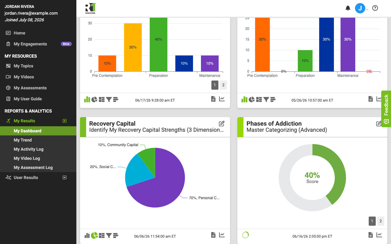
Chart controls
View a prior result
Numbers above the chart (1, 2, 3, ...) represent each time you completed the activity — 1 is the most recent. Select a number to load that result; the completion date and time shown below the chart updates to match. If you completed the activity more than five times, use the arrow buttons to page through the numbers. No numbers means you've only completed the activity once.
Change the topic or activity shown
- Click the chart's title area (the topic and activity name at the top of the chart).
- In the Change Topic and Activity window, select the topic and activity you want to display.
Reorder the charts
Drag any chart and drop it in a new position. On a tablet or other touchscreen, press and hold the chart for a moment, then drag it; a quick swipe scrolls the page instead. Use the Save button under Layout to keep the arrangement.
Change the chart type
For card-sort activities, icons at the bottom left of each chart switch between chart types:
- Bar chart — results as vertical columns in model order
- Pie chart — results as proportional slices
- Tree map — most-selected categories displayed largest
- Funnel chart — results ordered largest at top to smallest at bottom
- Horizontal bar chart — percentage of Yes cards per category
Knowledge check activities display as a pie chart only.
Open the full report
Select the report icon (document) at the bottom right of a chart to open the completed activity report for the result currently displayed.
View the trend
Select the trend icon (line chart, last icon at the bottom right) to open the My Trend tab for that activity, comparing results across every time you completed it. See My Trend.
Layout options
The Layout controls at the top of the dashboard switch between saved views:
- My Recent Activity — loads charts for your most recently completed activities. This is the default view.
- Company Default — loads the topics and chart order your organization has set as the default.
- Save — saves your current arrangement (chart order and selected topics/activities) as your personal custom view, which loads automatically on future visits.
Was this helpful?
Thanks for the feedback!